Expel Design System


Expel is a cybersecurity company that provides 24/7 managed detection and response (MDR) across cloud, network, and endpoint systems. Its platform, Expel Workbench™, combines automation and human expertise to quickly detect and respond to threats.
This project aimed to create a code-based UI library that enables faster feature delivery and supports white labeling, dark mode, responsiveness, accessibility, and security compliance.
Role
Lead Product Designer
Business Impact - Designers
Reduced workflow design time by 50%
Business Impact - Engineers
Cut implementation time by more than half
Project Overview
Our platform was built on an outdated codebase, creating significant challenges in usability and accessibility. Internal security analysts and customers were struggling with navigation and functionality.
Problem & Technical Challenges
- Inconsistent design elements across the platform
- Difficulty accessing critical features
- Lack of dark mode (highly requested by users)
- Poor responsiveness and accessibility
Business Goals
- Improve internal efficiency and operational excellence.
- Improve usability scores.
- Mature internal tools and processes with more up to date and secure software.
- Improve accessibility
Solutions
- A code-based library of components that are accessible and scalable with documentation.
- Ensure high quality modern and cohesive user experience.
- Create and export component tokens that reference semantic tokens for border-radius, size, space, color and typography.
- Create different modes or themes to allow for dark mode and white labeling.
1,000
Components Replaced
Replaced over 1000 uses of outdated elements with scalable components using atomic design principles.
50%
Time Saved
Designers and engineers cut their design and implementation time by more half.
16%
Usability Improvements
16% Improvement in customer SUS scores, going from "Good" to "Excellent"
28%
Usability Improvements
28% Improvement in the internal SOC's SUS score, going from "Poor" to "Ok."
Projected Business Impact and Results
Process
1
Research and Audit
Conducted thorough audit of existing platform, mapping all elements to components and gathering user feedback with usability studies, component mapping, and pain point identification.
2
Token and Theming Creation
Built a strong foundation with a semantic token library for border-radius, typography, spacing, size, and color consistency.
3
Developed and Designed
Built components following Atomic design model, starting with base elements and progressing to complex patterns including accessibility.
4
Documentation
Established documentation with Figma, Zeroheight, and Storybook for seamless design-development handoff.
5
Team Integration
Implemented feedback loops with daily stand-ups, design reviews, and dedicated request channels.
Assets
Loom Videos
I recorded videos when components were published in Figma to show designers how to use the component and what went into building it.
Figma Input Audit
Screenshots
Our form inputs were one of the first components we built as they were the heaviest used throughout the platform and there was a mix of bootstrap, ember, and hard coded inputs.
As I designed them and the design system matured (as well as Figma releasing new variable options and grid auto-layout), there were decisions made along the way that improved how the components were built and referenced tokens. I went back, conducted an audit of the tokens referenced and how the inputs were built and made tickets for clean up work and design debt to ensure consistency.
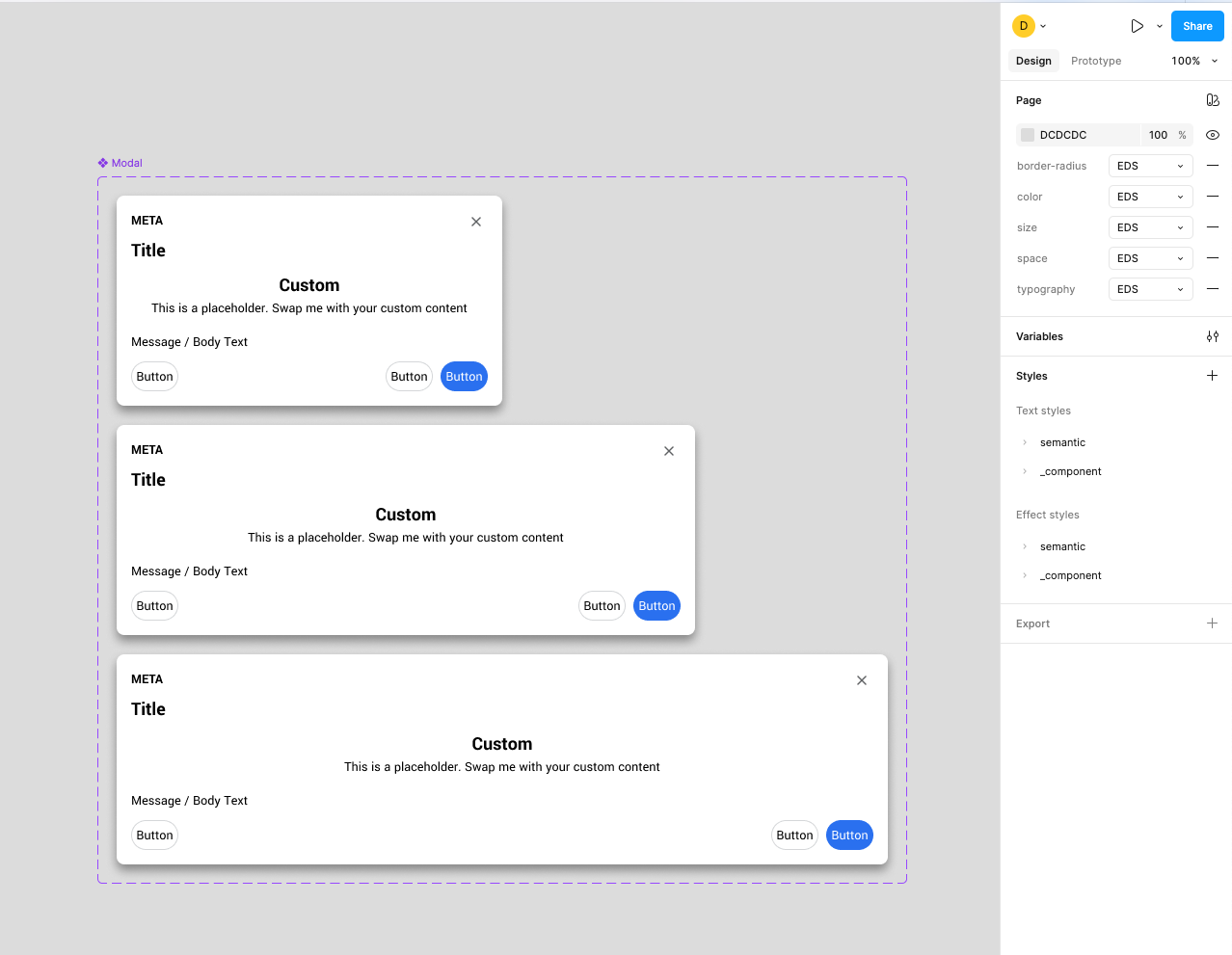
Components and the different states, tokens, dark mode theming, documentation.
AI Workshop to Align on AI feature Components
We held an AI workshop with design and engineering to explore how AI could fit into our design system. Using fast sketching and group discussions, we mapped potential components and workflows to automate tasks, generate summaries, and keep AI interactions consistent. This produced a focused list of AI features to prototype and a shared plan for scaling them.
Project Outcome
The design system transformation delivered significant improvements in user satisfaction and operational efficiency.
This project transformed our platform into a modern, user-friendly interface that effectively meets both user needs and business goals. Through systematic collaboration and a focus on user experience, we successfully migrated to a design system that enhances usability and facilitates future development.

Atomic Design
Built scalable components following atomic design principles
Accessibility First
Ensured all components meet WCAG accessibility standards
Dark Mode Support
Implemented theming system with dark mode capabilities


