FiscalNote Entity Page Rebuild
The Product
FiscalNote supports organizations to monitor, manage, and act on the issues that are important to them by combining policy and stakeholder data with AI technology and expert analysis.
The Challenge
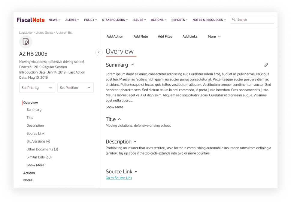
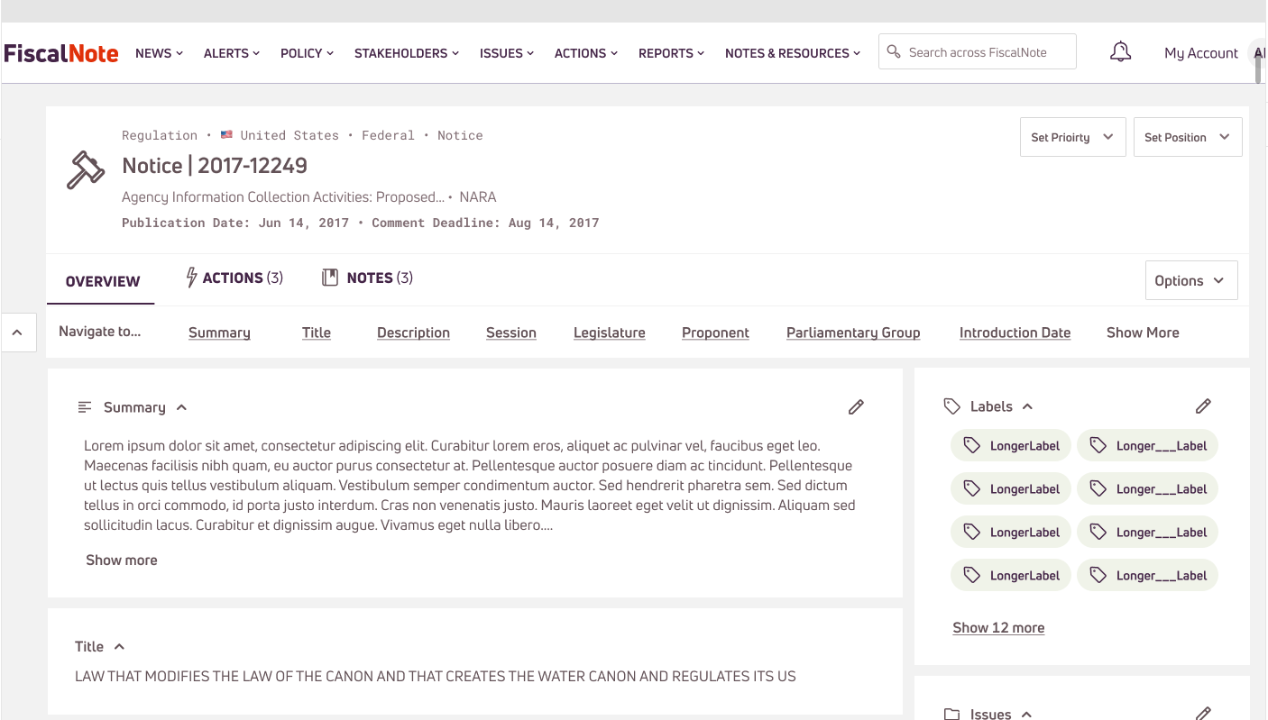
The FiscalNote core platform was being rebuilt on rails to better improve functionality. Entity Page Rebuild Project required that all policy and stakeholder “profile” pages be rebuilt. There was a lot of opportunity here to make these pages accessible, improve consistency (the pages all had different design systems applied), and improve UX.
Unfortunately, when I was assigned Lead Designer for this project, the engineers had already started building (big red flag). We had no time for discovery work.
My Role
As lead designer on this team and not having the opportunity for true discovery work I made the decision to gather all user research we had regarding entity pages, reuse existing components and designs, create new components that could fit across all different data sets for these pages (this was a big challenge). I prioritized consistency and small UX improvements.
Project Summary
We descoped a lot of functionality in order to get the project to an MVP state and opted in users to participate in the “Alpha Release” for feedback. We received very bad feedback on these pages from our external and internal users (we failed) and had to make quick decisions to fix it.
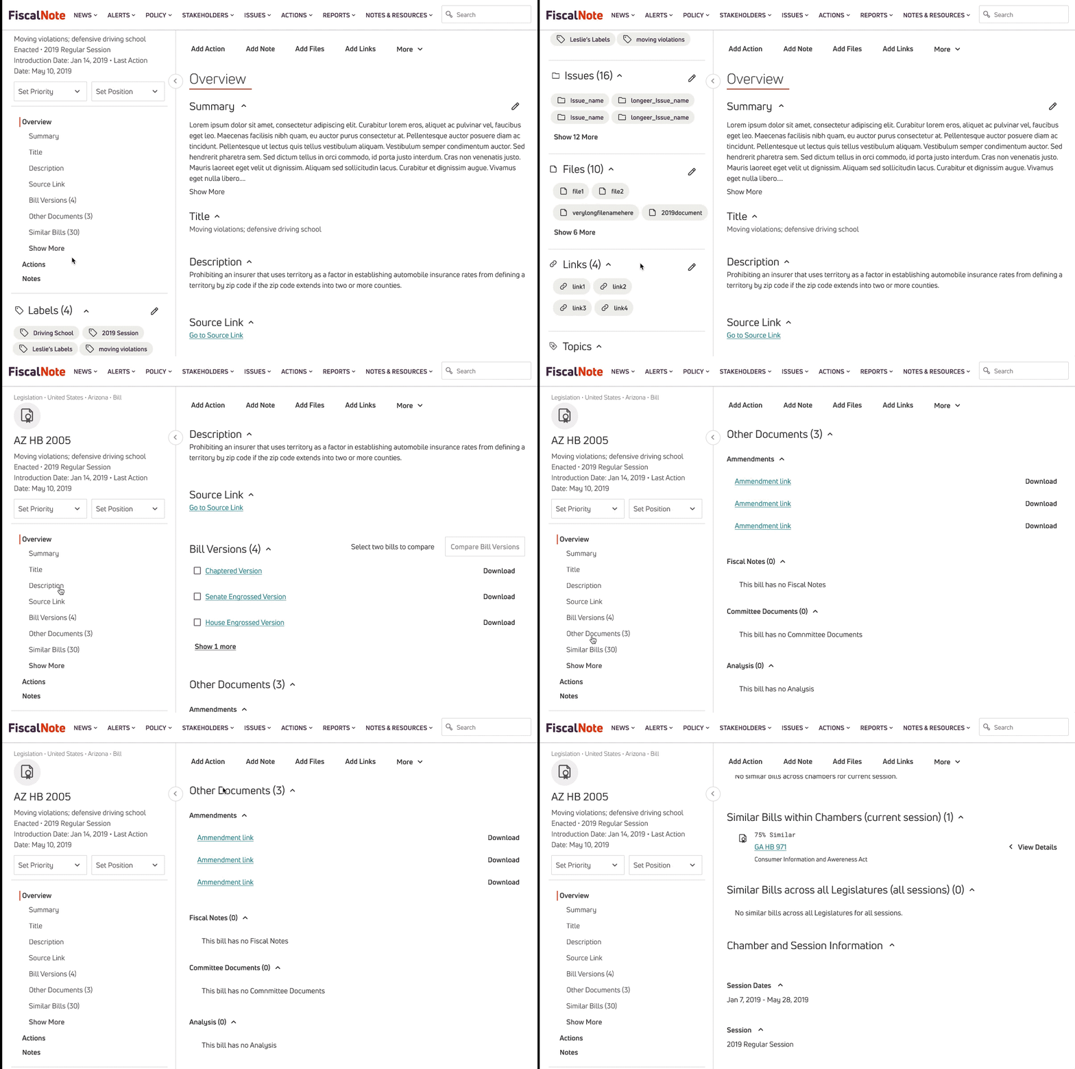
During my early design stages, I had played around with some “in-page” navigation features and re-surfaced those concepts. I listed out the Jobs to be Done for our users, and mapped updated designs to match these Jobs to be Done. I spearheaded a prototype user test for internal and external users and mapped the tasks to Jobs to be Done and relevant user flows to test my hypothesis that in-page navigation could be the solution that solved many pain points. The data and qualitative feedback was significantly better.
Inventory
Our engineers had already started rebuilding the profile pages, which encouraged me to make quick decisions. I gathered as much information from previous platform usability studies and user interviews and pulled out any information regarding entity pages.
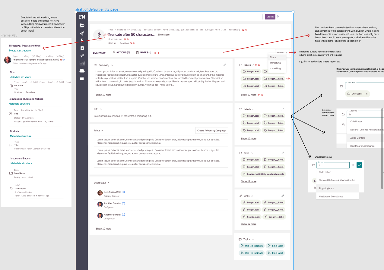
I also made the decision to use a previous project’s (actions) profile page knowing that we could not only re-use design components but also engineering could re-use some components from these pages. This would also help establish consistent patterns (as well as appearance) for the platform which was a global pain point.
Major Pain Points from User Interviews and Usability Studies:
Users were unable to locate bill summaries (they were in different places and it wasn’t obvious it was user generated)
Users mentioned the information was overwhelming and didn’t know certain items even existed on the pages because they were tucked away (and it wasn’t a one size fits all)
Design and Descope
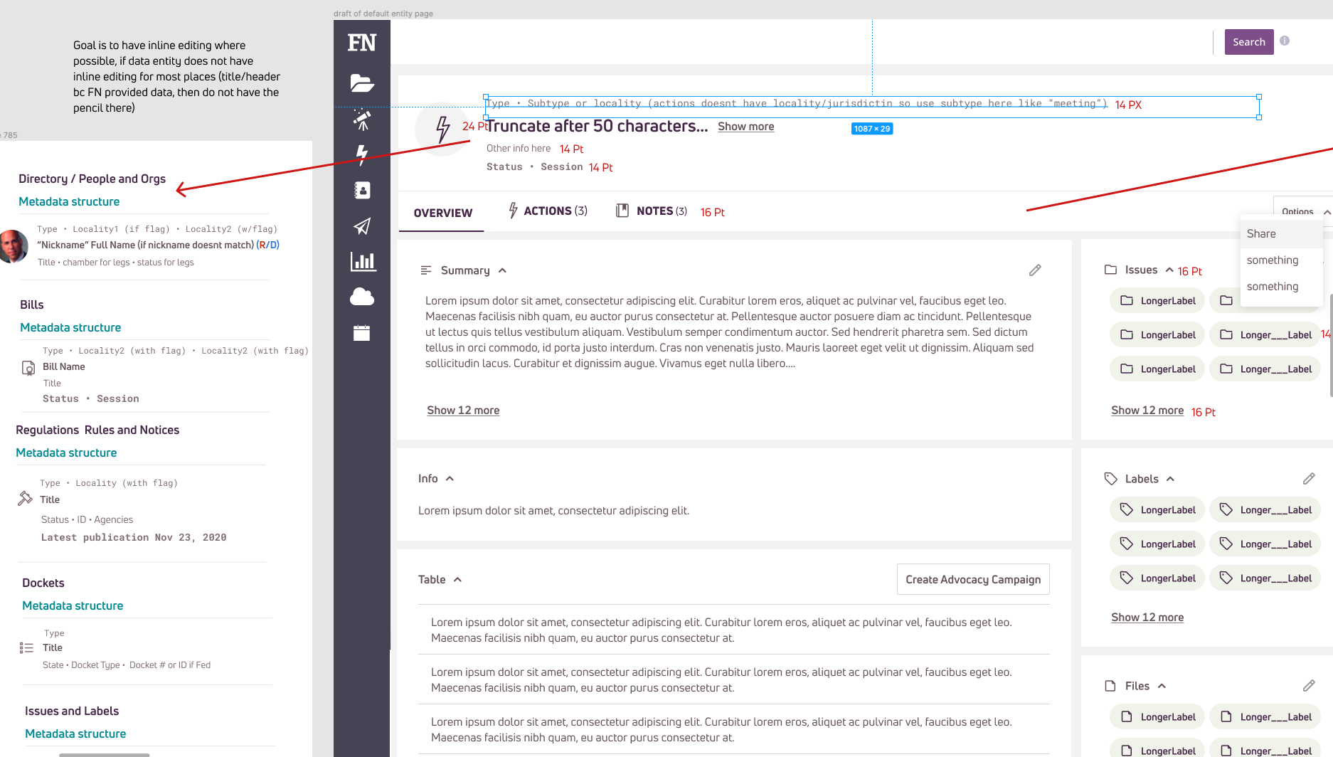
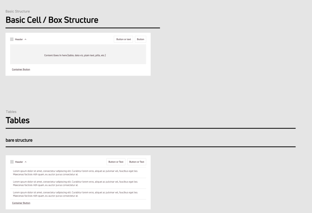
I began breaking down the existing pages and looking at consistent information across the different data sets to see what existing components could be applied to what and what new components needed to be designed. I started by taking the actions profile page and creating a “default” template for entity pages to build upon.
As I built out on of the legislation pages for U.S. State and Federal data, I realized the page was becoming exponentially long. I played around with some in-page navigation ideas that were descoped because we needed to get the pages out with feature parody and quick win features.
Release & Gather Feedback
We released the Entity Pages for Alpha users and received negative feedback. After evaluating and synthesizing the feedback I recognized that the main problem users were having was all surrounding discoverability. Sales and Account managers kept mentioning scrolling being problem, but scrolling is only a problem when it’s the only function you can do to find what you are looking for. I truly believed given the feedback, that an in-page navigation or table of contents would solve a lot of our users pain points.
I pulled up designs from early on in the project where I explored in-page navigation
Conceptual Design
I applied the new Design System styles to conceptual in-page navigation designs and rearranged the page to provide for better discoverability.
Jobs to be Done for Users
Policy users need to…
Know what is this bill / regulation / docket about? Is it relevant to my issues management team?
Know what is the status and lifecycle of this bill / regulation / docket?
Monitor and track bills / regulations / dockets etc. and if there are any changes.
Know if there are any other bills or regulations associated to bill / regulation / docket.
Organize key information to be able to find it quickly and track.
Stakeholder users need to …
Understand the stakeholder’s profile and everything about said stakeholder.
What is this stakeholder sponsoring?
Manage and track any key changes to stakeholders.
Get ahead of any risks or issues that may come if stakeholders oppose or support a bill.
Log key interactions with stakeholders for tracking and reporting purposes.
Organize key information to be able to find it quickly and track.
User Testing
Breakdown into Phased Release
In order for redesigning the entity pages with in-page navigation to be digestible for our lead engineer to provide estimates, I broke out the designs into 4 step by step phases that could also add value to users.
Release & Gather Feedback
Phases 1-3 have been released and once phase 4 is released, the next steps are to work with Product Manager to gather feedback through moderated user studies (via Gong) and in-platform surveys (via Chameleon) and measure against our first round of feedback to see level of improvement with these new designs.
